
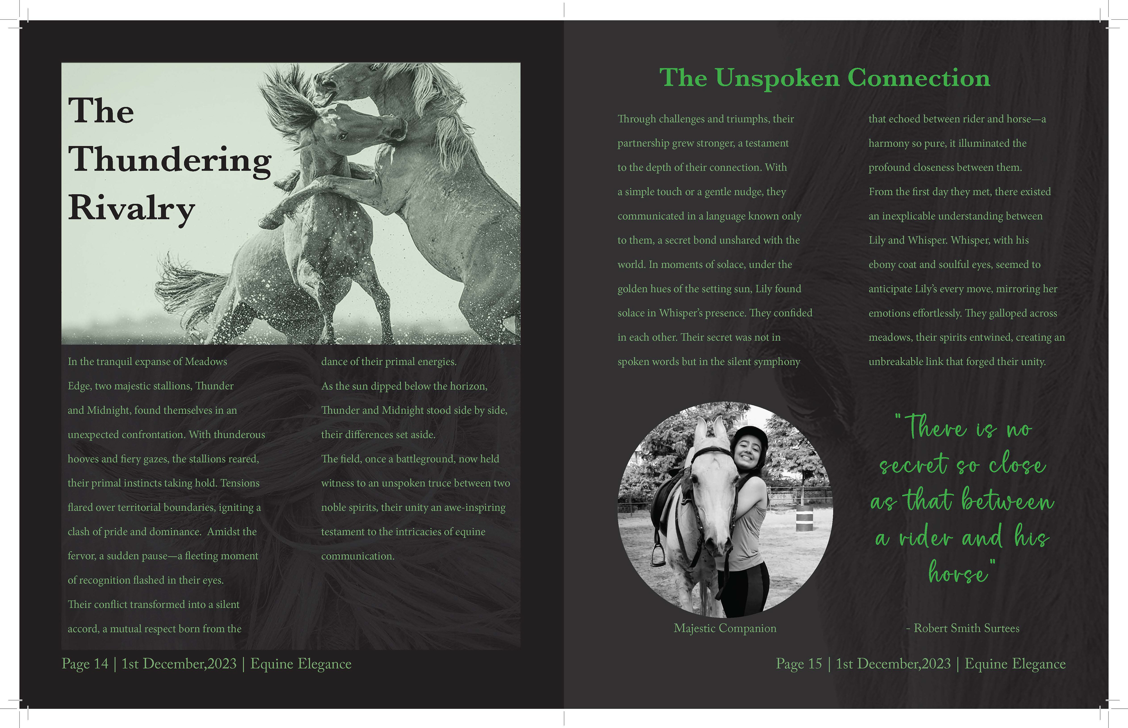
The final magazine spread showcases a dynamic and visually captivating layout centered around the images of horses. The horses are placed strategically to create movement and flow across the spread, guiding the reader’s eye from one section to the next. The background is kept minimal to allow the images to stand out, while the color palette complements the natural tones of the horses, enhancing the overall organic feel. The typography is clean and modern, with green bold headings and clear, readable body text that harmonize with the images. The layout strikes a balance between visuals and text, creating an engaging reading experience that feels both sophisticated and impactful. The final design captures the essence of the subject while maintaining a professional and polished magazine aesthetic.


